Solution
Our discovery stage begins with a deep-dive into an organisation's ‘Brand Heart’ - their Purpose, Vision, Mission and Values.
We swiftly learned that this re-brand needed to convey NESPF as highly knowledgeable, transparent, experienced and local - driving a key purpose message: "Everyone deserves to have a financially secure future and we can help them get there."
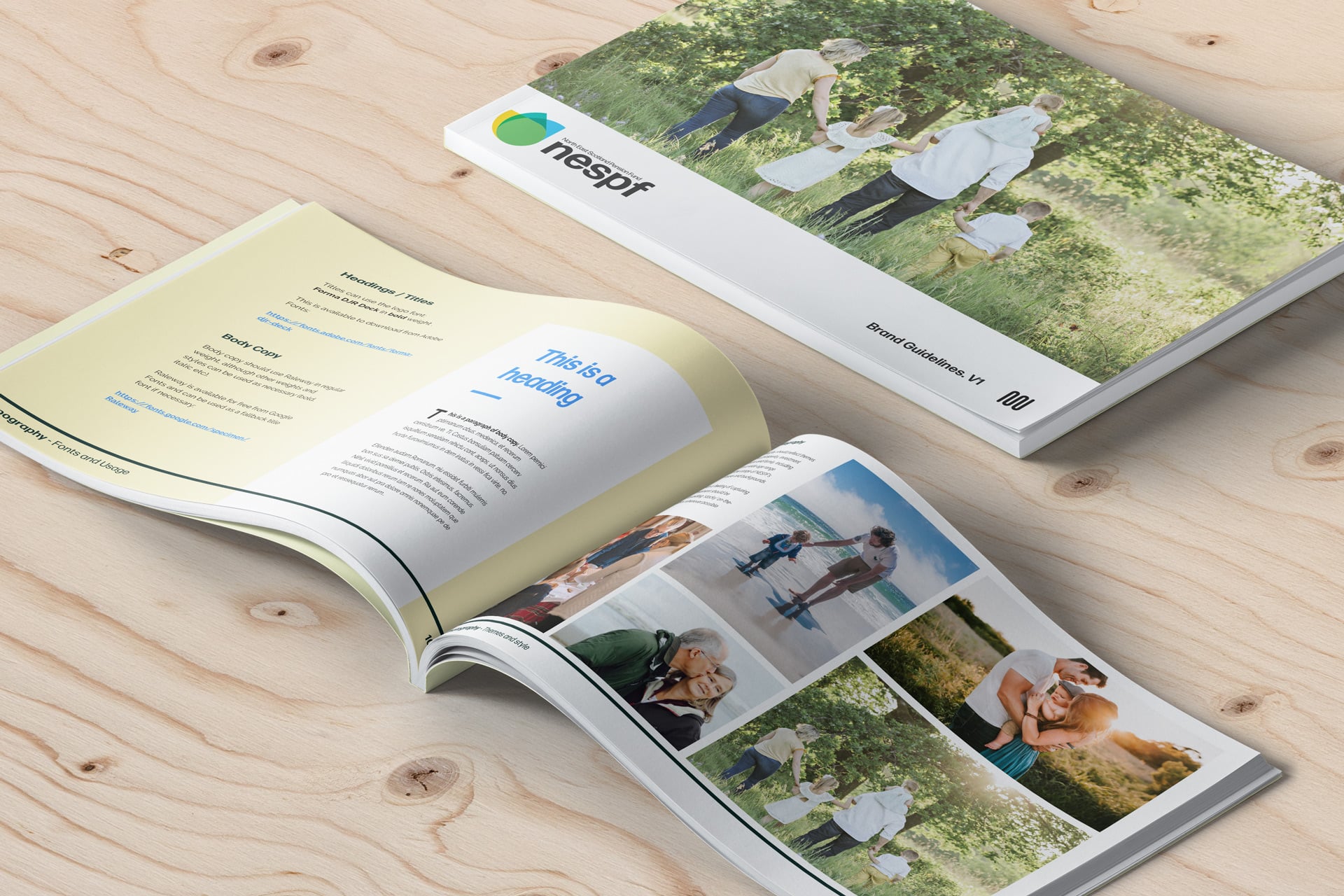
We had to create a brand that would break down traditional stigmas around pensions, taking them out of the grey and into a more personable and helpful realm.


NESPF’s local geography was another key theme to drive through this new brand identity and the client was very enthusiastic about drawing on inspiration from NE Scotland’s renowned coastal landscape and wildlife which influenced the palate and form of the new branding.
Following brand concept feedback involving a focus group, we decided to explore the following themes: welcoming / relaxed / growth / open / nature.
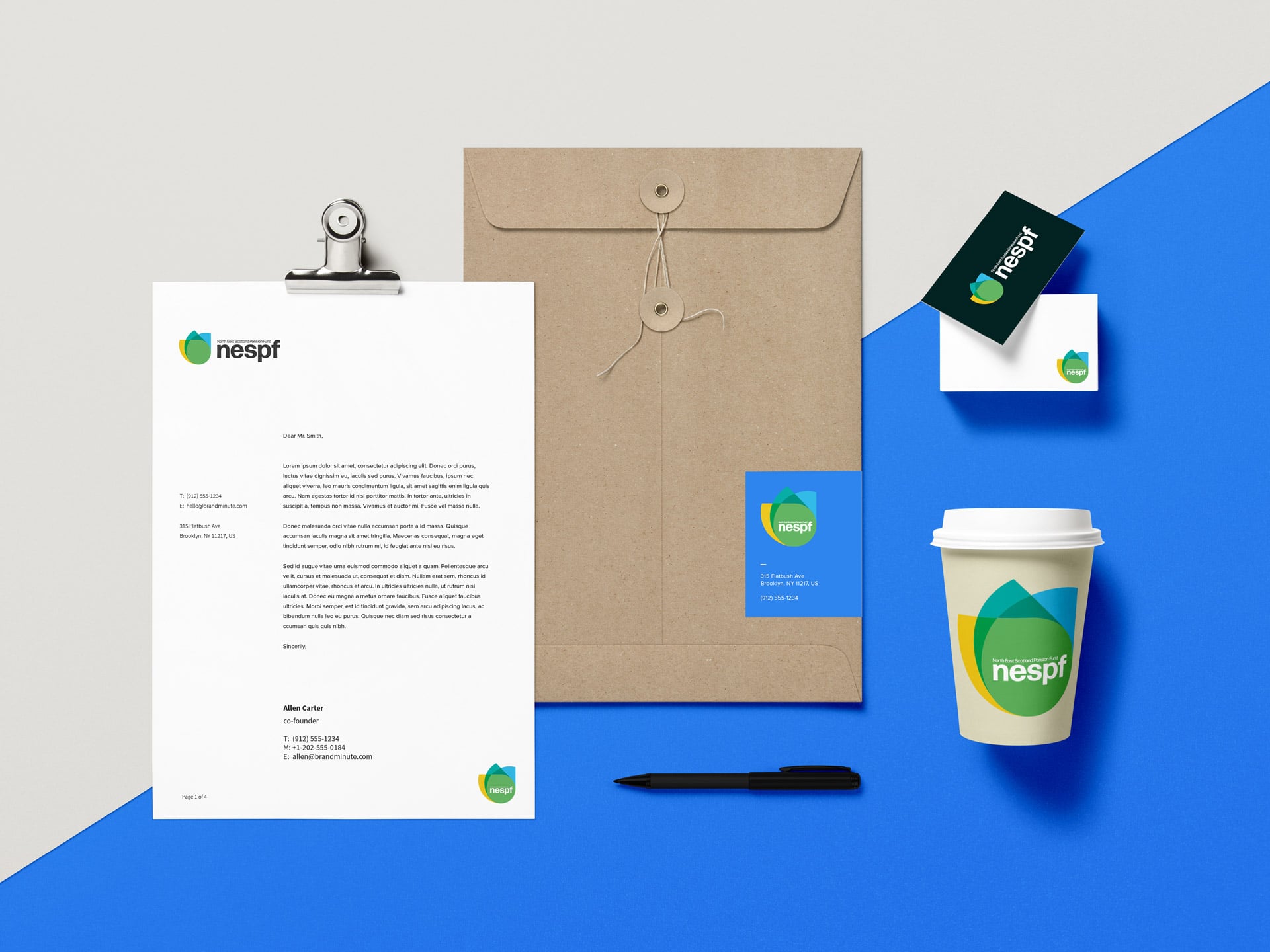
A motif inspired by the iconic puffin took flight and was combined with nature’s palate across sand, sky and sea. This 3-layered theme also represents nurturing and growth across NESPF’s three member types: Active, Deferred and Pensioner.

NESPF's revitalised online presence offers the 3 distinct user groups a tailored, intuitive and informative user experience with the values and aesthetic from the branding evident throughout.
To boost user-friendliness, copy was kept simple, jargon-free and broken into small paragraphs as part of the Designs.
Visual content, including infographics, interactive elements and images which avoided the cliched financial service/retirement route were deployed to further reduce the word count and increase engagement.

Ease of use was paramount to NESPF, especially given the target elderly age group. Clear and simple access to the Resource section provides help in answering questions on what can be quite a complex subject.
While pension related concepts such as the ‘The Rule of 85’ was explained via an interactive ‘checker’ with an animation to explain how a pension is calculated and builds up.

The site is built on the Umbraco CMS with editable and modular content blocks that allow NESPF to easily choose from pre-designed layouts and add/remove/swap-out different blocks (resources, FAQs, blogs, enquiry form, video) as required.
A secure login for the Board and Committee provides access to all-sensitive documentation. NESPF's growing resources and downloads, whether publicly accessed or permission-based are centrally managed through Umbraco.

With the web being a dynamic medium, subject to technological and behavioural advances, it is crucial that we have our clients' back to ensure their digital presence is up to speed, ranks well and offers the best user experience regardless of where the user is, their connection or what device they are using.
Each month we report on a range of metrics including website traffic and interactions, page speed insights and content optimisation to ensure NESPF and their web visitors are getting the service experience they deserve.

For more on our digital partnership with NESPF, click here for our interview with Senior Comms Officer, Louise.
From the start, Radiator took the time to understand who we were as an organisation, the issues we and our members faced and what we wanted to achieve moving forward. Their engagement, level of knowledge and expertise proved invaluable and the end result exceeded our objectives and expectations. We are delighted and proud of the outcome and look forward to continuing this partnership.
Louise Campbell , Senior Communications Officer, NESPF


