We're always keen to get a client's take on the delivery of a new site or branding; shedding light on the motivation, challenges, rewards - and of course the final outcome from the all-important client perspective.
So we were delighted when Louise from NESPF agreed to a coffee and chat and open up on our recent re-brand and website redevelopment work - we hope you find Louise's experience insightful.
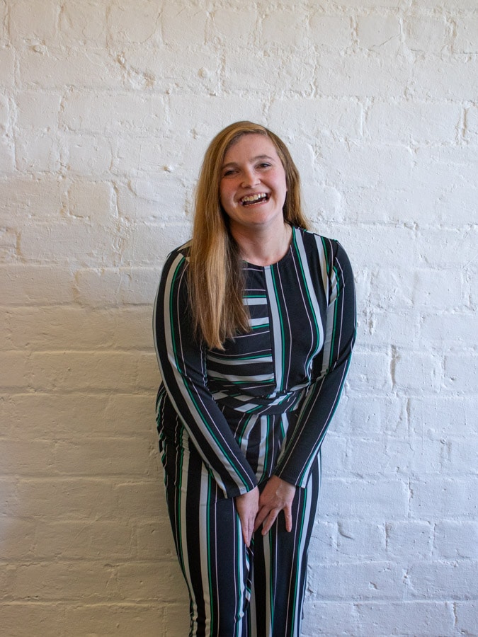
Louise Campbell, Senior Communications Officer at NESPF interviewed in February 2023 by Radiator co-founder and client director Stephen Hunter, and digital producer Molly Sheridan.
Stephen Hunter: What drove the decision to re-brand internally?
Louise Campbell: Fundamentally, there was a need and desire to tackle some of the issues that exist in the pensions industry, and which are not unique to NESPF. We’re not seen as the most approachable or friendly industry in the world - this can even extend to mistrust.
It became clear during our early conversations about the new website that a re-brand was required to match what we wanted to achieve, and which would reflect how we wanted our members to think and feel about our brand moving forward.
SH: Would it be fair to say that as a result of your evolving digital strategy, and how you were becoming more sophisticated and better presented – you felt that you needed to bring the brand identity to the same level?
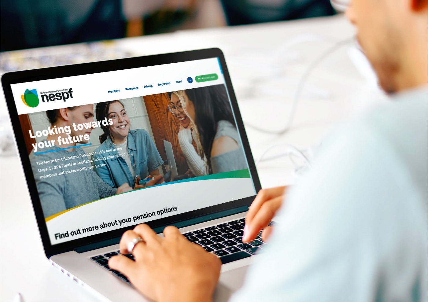
LC: Yeah definitely. We didn’t have a strong brand identity before, if at all. We were moving a lot of our processes online, specifically to our online portal which had been implemented a year or two previously.
Given it was a far more recently developed site, it had a much better look and feel, and it really highlighted the potential of fully thought out, professional designed and established brand identity.
One that could not only take our out-of-date website to the next level but that could help all our communications and build up our relationship with our members.
SH: That’s exactly the motivation you strive for through not just branding but also UX design in general: better comms, better empathy. In terms of the steering group and who made up team NESPF from your perspective, can you remind me -
LC: So, we had representatives from each of our six teams across the pension fund, some teams had two, given their size, - in all, there was ten of us in our group.
There was a mix of experience; some who had been with NESPF for years, others not long in the door who didn’t really know a lot about pensions. We made sure that our selective group was somewhat representative of our own member demographic in terms of age range and profile.
In terms of internal approval, all ten were involved through the branding process with final approval needed through a presentation to our Trustees.
SH: How do you think our branding process ultimately helped the process and the outcome?
LC: Everything was made clear from the start and all the way through; what we were doing and to why.
Even the branding exercises that had colleagues out of their comfort zones, an example being: ‘What kind of car or animal would best represent our brand?’ were ultimately well received in getting the most out of the process and making us think differently.
SH: Can you remember what car brand you represented...for reference?
LC: I can'’t recall the car brand. We did acknowledge that we were something a little dull if reliable and that doesn’t really change over time but wanted to move to something more approachable and fun.
For an animal, we agreed on an Owl – they are wise, can look quite stern, tend to hole up and venture out only when necessary!
Through the process, it was clear to see how the brand identity evolved. This was helpful when presenting to our Trustees, as we could clearly explain the decision making process and exactly how we had arrived at our final design.
Without providing that context, they might have been more reserved but we were able to explain exactly what we were trying to achieve, and the various options that had been explored with Radiator.
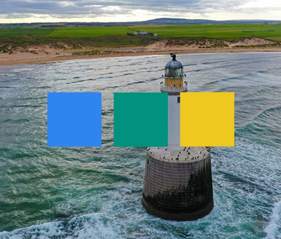
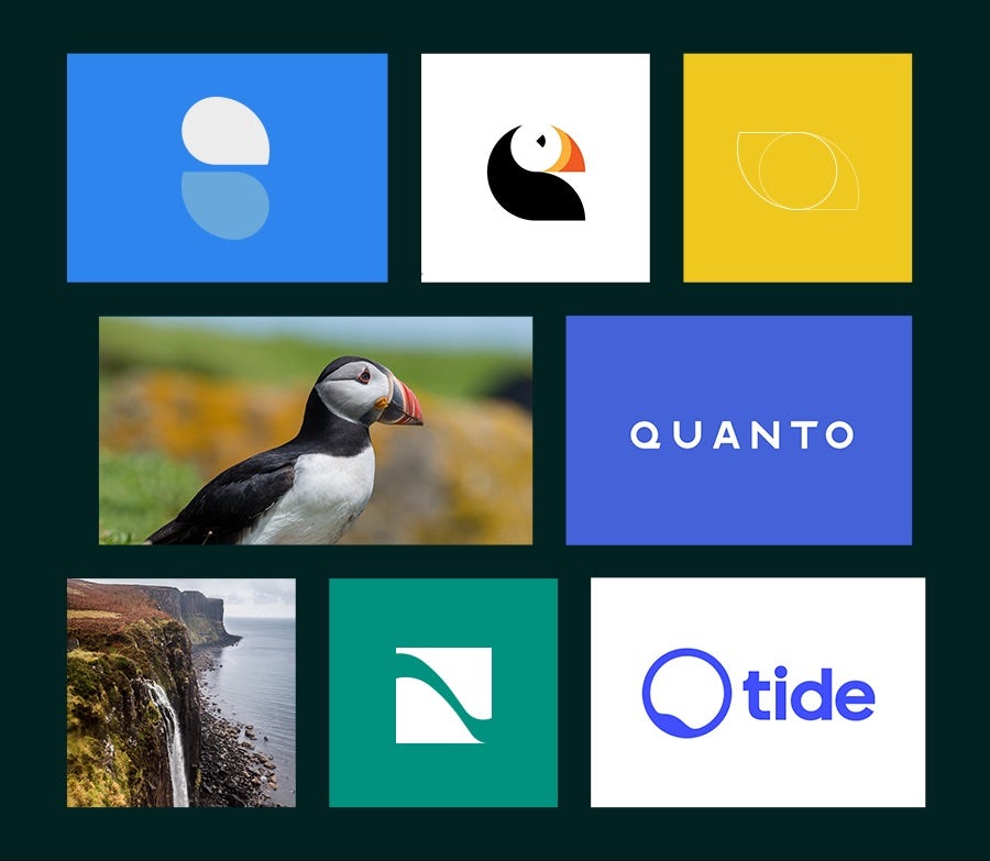
LC (continued): The process allowed us to draw on what people liked and disliked – all feeding into the final branding outcome.
I remember one early internal feedback session, where I had printed off all the initial designs so we could physically jot down sticky notes with feedback. This was a fun and interesting experience for us all – something different!
Overall, I would say that the branding process went really smoothly.
SH: That is good to hear - we always aim for a fun and motivational experience!
LC: Yeah, but it wasn't anticipated. We weren't planning to do a rebrand, just the website but now I can’t imagine doing it any other way. It did put a little pressure on us as we wanted the new website, and now branding, launched before our annual pension June statements in June.
I remember one early internal feedback session, where I had printed off all the initial designs so we could physically jot down sticky notes with feedback. This was a fun and interesting experience for us all – something different!
Louise Campbell, Senior Comms Officer, NESPF
SH: Isn't it funny that there is always a bit of a rush to launch something, it's just the nature of it. A new site or rebrand survives way beyond the launch and that’s why we’ve got to manage you through that process.
But it's equally got to be a balance; you don’t want a compromised solution because it's such an important thing we are completing for you.
LC: That’s it and initially we wanted to go live in April because that would have coincided with a big mailing. But with the additional rebrand work, and then COVID, that timeline was scrapped. But it is funny when you put it like that.
Why do we rush it so much? What's an extra month when you will be using it for years!
SH: Exactly! And now that it has been live for two and a half, three years – what are your views on how it has positively impacted the organisation?
LC: At that point we were moving more processes and communications online, and although COVID happened during this process which brought a bunch of issues, long term it worked in our favour.
Our digital transition required a massive push – we were not alone in that industries across the country suddenly had to do things in differently and adopt new digital processes much quicker anticipated, and customers and members had to do so too. Developing a fabulous new website, that we can confidently direct members to has been invaluable.
Implementing more online processes just wouldn’t have been possible without the branding and a fit for purpose site. Our digital first strategy would never have been as effective.
SH: And your Members’ Portal that your site integrates with?
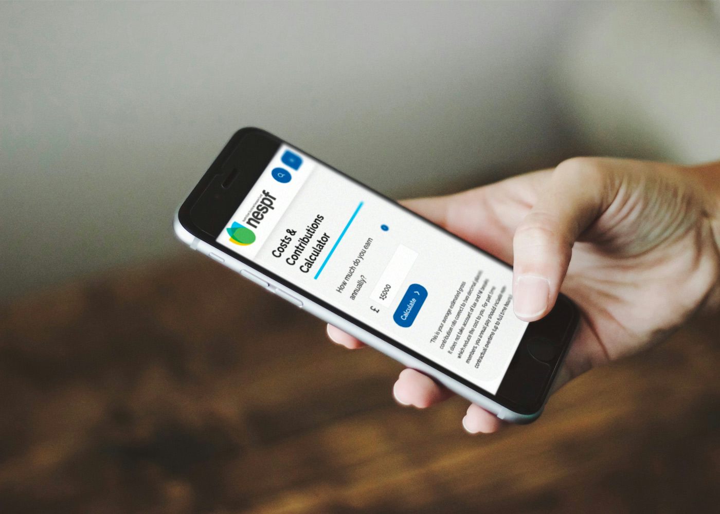
LC: Our members know it as ‘My Pension’ - similar to online banking for members where they can login and see a range of pension information, for example what your pension is worth and what your pension might be when you retire.
The website is more of an information hub for members, more generic - it’s purpose is to deliver information in an easy to understand way and to encourage more members to self-serve.
SH: In terms of the day-to-day management of the site from your perspective - Do you find easy? What tasks do you tend to keep your eye on?
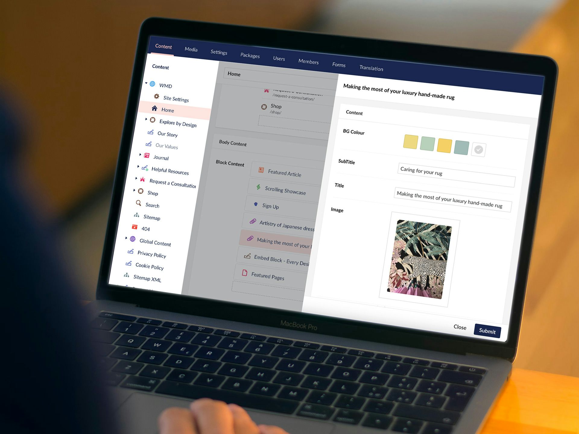
LC: I find Umbraco incredibly easy to use, especially compared to other CMSs. I've just successfully trained up colleagues, who have no web management experience to use it – which speaks volumes!
Our website management isn’t too taxing. We run monthly checks and do a quarterly top to tail of the site to make sure everything is running smoothly.
Other than that, it's keeping things up to date, publishing new content across news articles and yearly changes, and monitoring the range of enquiries that come through. Every time we need to make changes, it’ is easy to do.
I find using Umbraco incredibly easy especially compared to other CMSs. I've just successfully trained up my colleague to use it – which speaks volumes!
Louise Campbell, Senior Comms Office, NESPF
MS: I train a lot of clients on Umbraco and its ease of use certainly makes my job easier. The admin user interface is self-explanatory and it flows really nicely – clients just ‘get it’ with all the main areas: ‘that’s the page I need to edit’, ‘there’s the content block’, and all through a familiar text editing environment.
LC: That’s it – when we got the site, you had pre-populated a couple of key pages for us, and once we understood what each module was, it was a case of ‘Ok, how do we actually want to display all of this information?’ Our website is text heavy, so we need to figure out what content makes the cut and how best to present it.
SH: If you were to give other pension funds advise or any other organisations advice – what would you say are the challenges to look out for and how to get ready for a digital project like this?
LC: My advice would be to really think about the content and how you want to present it - as you’ll spend a decent amount of time creating new content and populating it.
And think of it from an end-users’ perspective – remember this online experience is meant for them, it’s not an internal presentation!
SH: It's that marriage of look and feel, the page layouts and the content. You don’t want a disconnect. Going back to the branding exercise, being able to revisit your brand identity unearthed a lot of these values, the key selling messages and your proposition – so that dealt with that big world. Having the chance to refine and re-energize your brand positioning got us off to a very good start.
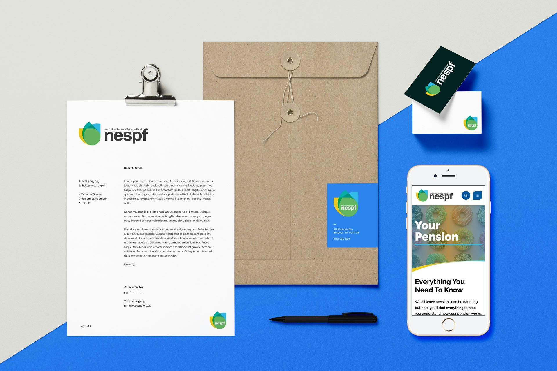
LC: The brand exercise was hugely important, went smoothly and helped guide us, as you say, with our brand-related ideas, our vision – which gave us a great head-start and fed into the look and feel of, the content, and the visuals as we began to populate the site.
I dread to think how the website could have looked without the re-brand and with our old logo!
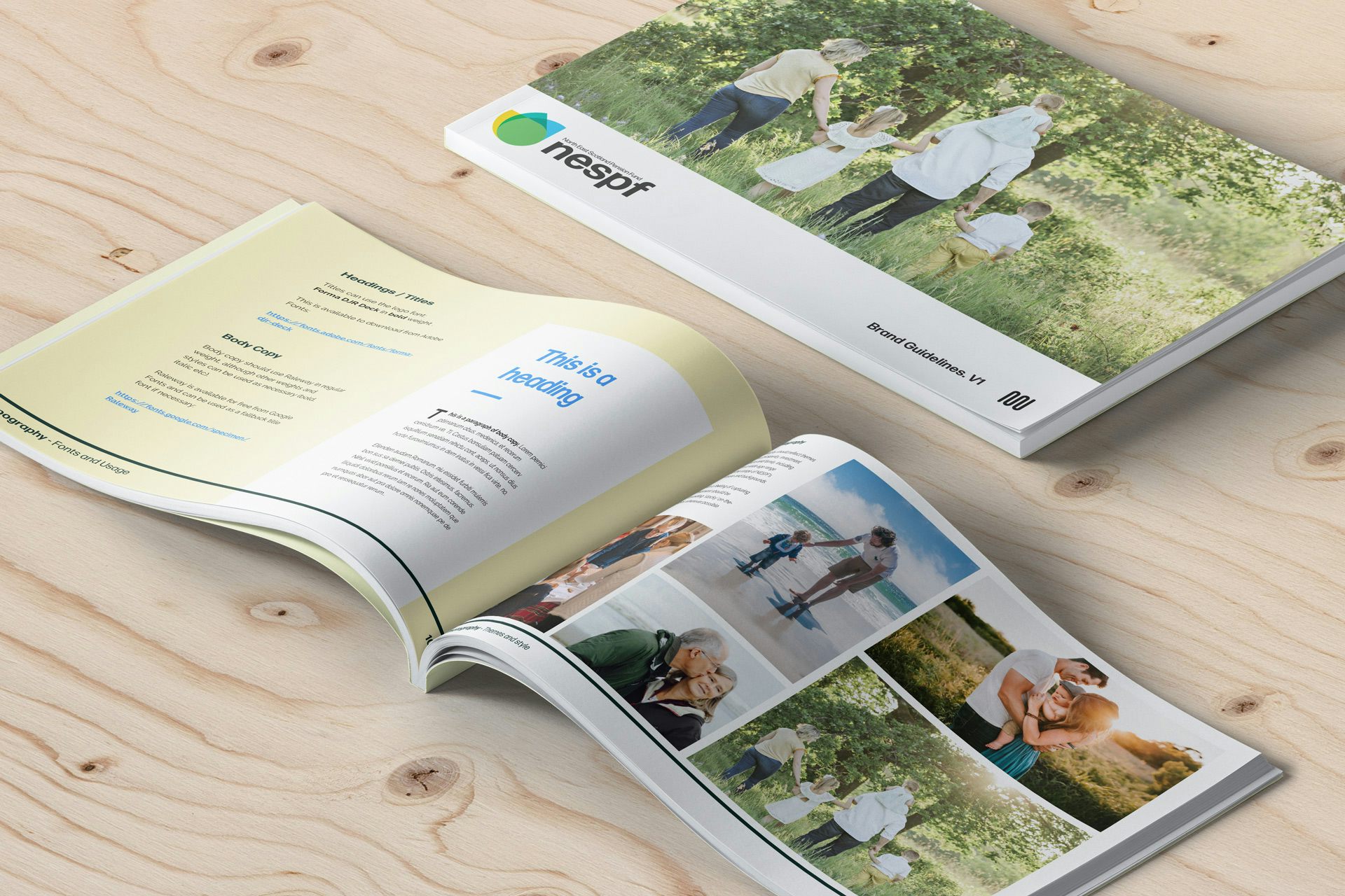
The brand toolkit was embraced internally and by other suppliers, resulting in a cohesive brand presentation across all touchpoints.
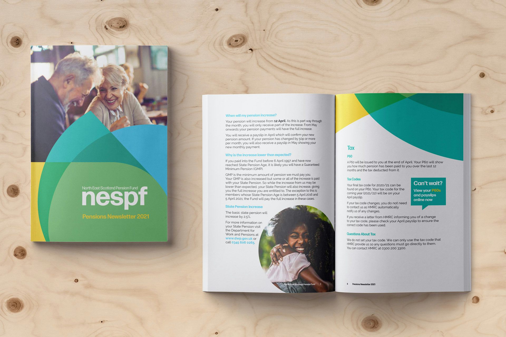
SH: Yes it helped distinguish your brand within the financial sector - there is a playful approach isn't there – it's almost childlike, the shapes and the colours and you embraced that - which led to simplicity and inclusiveness through your branding.
LC: That’s exactly what we were aiming for. I’ve already discussed the Pension sector’s image problem and how we wanted to challenge that.
We had some discussions internally and there was an early preference for qualities such as ‘Strong, Secure...’. So there were some challenges to explain that while those are traits we would want to be associated with if we can't get people to engage with us in the first place, how would you ever will we ultimately get that message across?
SH: The last area for me is how you can prove or demonstrate success to the likes of the board or anybody else – so what are the KPIs for you?
LC: We monitor the ongoing usage of the site – and around launch we saw a huge uptake in the number of people utilising our website based on YOY comparisons. We also keep a close eye on the kind of queries we get coming-in through our web forms, and the amount that are coming through.
The website is less about conversions and more about – how is the site being used, are users able to quickly find answers to their questions, member journeys and the ability to self serve. These are all good indicators that the site is functioning well.
During the first year we saw the following impact:
Even now, nearly 3 years after going Live, we continue to show positive website usage with a 25% increase in both users and sessions over the last 12 months.
SH: The stats don't lie! And in terms of the self-serve usage, do you attribute the uptake to the website or is that in your mind a completely separate journey?
LC: They're definitely connected - I monitor them separately but they are interlinked. Users will go to the website first before clicking to My Pension. The site purposefully engages users through generic information about retirement or contributions and points them to My Pension, where they can get more personalised information.
MS: That rounds off our questions - all that remains is to say a big thanks for your time and insights Louise, much appreciated!
Is it time your brand or online presence gets revisited? Get in touch today and we'll be delighted to get to know your brand and explore where we might be able to help take it, online and out in the wild.
